This project was completed as part of my York University’s School of Continuing Studies UX Design Certificate . For the introductory class, we were asked to generate a list of 100 random things from the website Random Lists and create an organization scheme for the items along with an explanation of how we arrived at that scheme.
Try To Be Cute
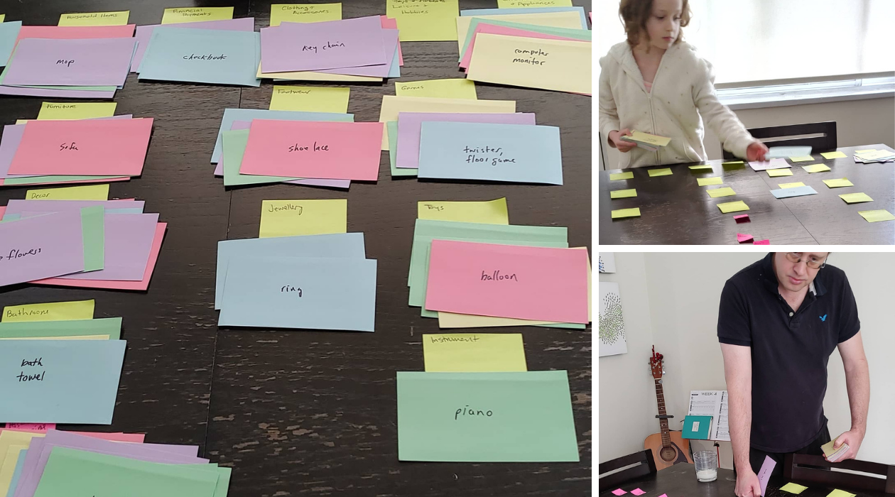
I wrote all my items out on individual index cards and started sorting. Initially, I liked the idea of fitting all the objects into the general schema of a house. Having parent categories being rooms in a home: bathroom, kitchen etc. and sub-categories representing specific places within each room: pantry, utility closet etc. In order for this schema to work, I had to make some leaps of logic, placing the sailboat in the garage. I put the drill press in the basement, in hindsight that seems very random. I also couldn’t properly address objects that might be in multiple rooms in the house, like a lamp or mirror . I abandoned this idea while trying to rationalize how street lights could belong in a den or home bar as it became apparent I was trying too hard to shoehorn too many of the items into my ‘house’ idea simply because I liked it.
Let The Objects Dictate the Organization
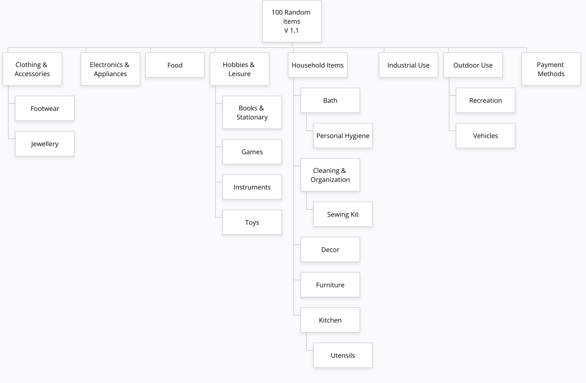
I did another open sort, this time grouping the items solely as I thought they related to each other. I came up with 12 parent categories and 10 sub-categories diagrammed below.

Closed Sorts Tests
I had my husband and 9-year-old daughter perform closed sorts, grouping objects into my predefined categories and sub-categories, to see if my schema made sense to them.
Observation 1: My daughter didn’t know where to put sidewalk and street lights because she didn’t know what Neighbourhood Infrastructure meant. She also asked what appliances meant. So, my IA is not going to be accessible to all ages and reading levels as it currently stands and I can’t just assume it’s good for all English speaking user groups.
Observation 2: I opted for words without pictures when I generated my list and some of the items could be interpreted quite differently. My daughter sorted the controller into Recreation > Games because she thought it was about a video game controller and reasoned the controller belonged with the video game . I had it sorted with Home Electronics & Appliances because I assumed it was a television controller, but now that I think of it that device is usually called a ‘remote’ , not a controller. Either way, Home Electronics is probably the better home for that item.
Less clear, my Husband sorted bow in with Clothing > Accessories because he thought it referenced a ‘bow-tie’. I sorted the bow into Recreations > Outdoors because I automatically thought the word referred to an archery bow, but it could also be a gift-wrap bow. Those are 3 very different objects with 3 very different homes in my IA.
I went back over my 100 items. Many are super-specific: plastic fork , fake flowers , soy sauce packet etc, but quite a few ( bow , needle , cork etc) are vague and the word will mean different things to different people. Teddies could be a reference to multiple stuffed bears, but it could just as easily be a reference to lingerie.

Add Description to Ambigous Items
If I was sorting 100 real objects I would go back and verify what they actually are and add more descriptive wording as necessary. I can’t do that here, I didn’t even generate pictures that I can cross-reference. I could rely on context. If you see a bow in Recreation>Outdoors you’ll easily deduce it’s an archery bow. But if you’re running Tree Testing, where the user has to find a bow it’s better for the user’s cognitive load if the text is more descriptive, because scanning organizational hierarchies and making deductions takes time and effort. Also, if I change or expand my IA and list items it would be better for maintenance if I use more reliable descriptions from the start. What if I add an R/C Car controller or dish-washing soap or something similar later on?
I went back and lightly edited my list of items where I thought there might be some confusion. My edits are in italics below:
- bath towel
- twister floor game
- teddies , lingerie
- sewing needle
- archery bow
- electronics charger
- computer monitor
- drinking glass
- gaming controller
- bar soap
- coat hanger
- computer keyboard
- wine cork
- shirt button
I don’t know if that’s cheating but I’m going to rationalize that it isn’t because the W3C wants wording on websites to be descriptive and accurate so people using screen readers can easily understand the content. If a sighted person needs a picture of a bow, controller or needle to confirm exactly what object it is then a sight-impaired person is going to need the alt text description of that image to be more descriptive too.
Consolidate Categories, Expand Sub-Categories
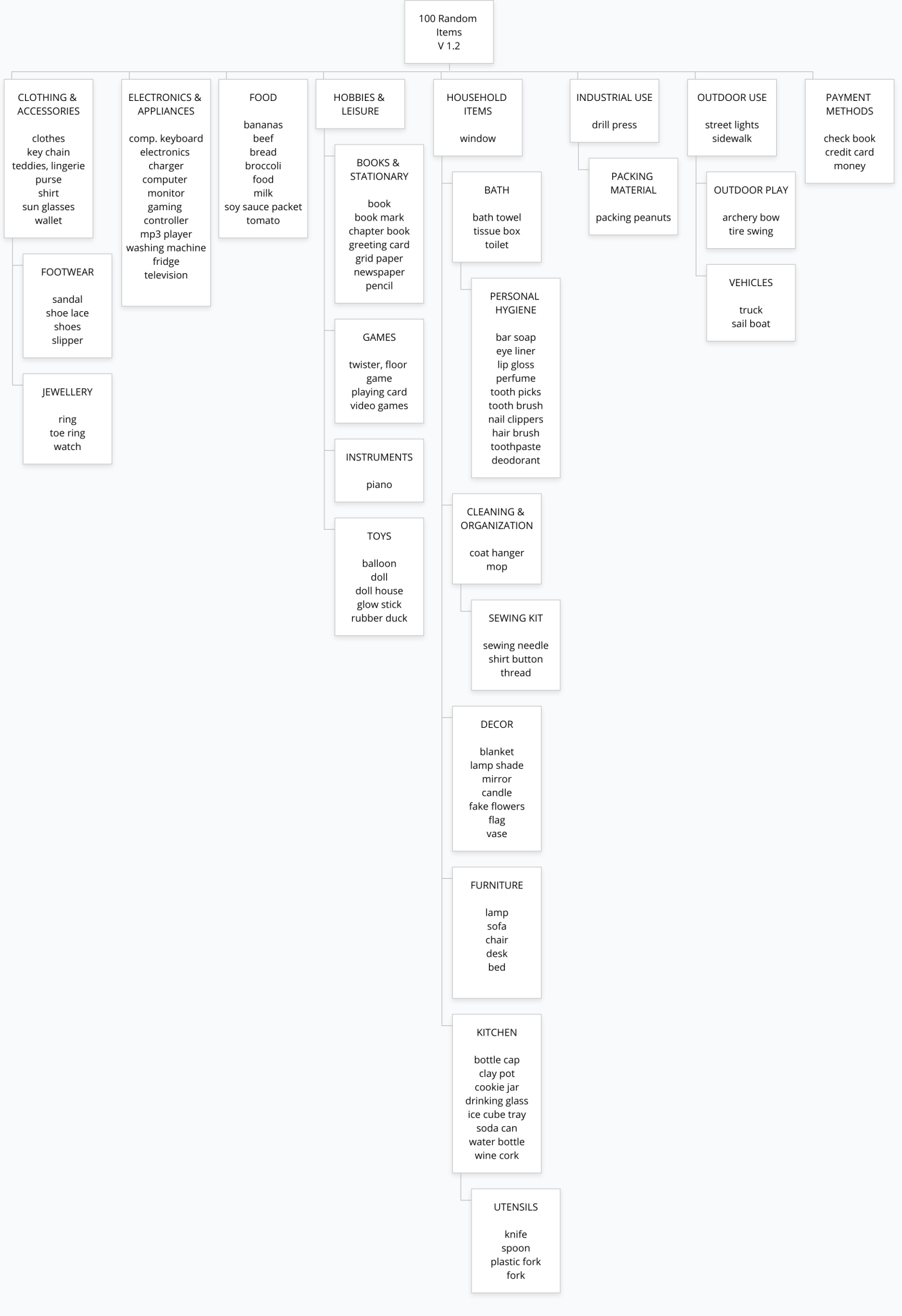
After I was done reviewing the descriptions of the items I took another look at my categories. 12 top-level categories seemed like a lot and the descriptions of some of the categories were weak and led to questions during the card sorting test. I ended up making 8 broader top-level categories and 16 sub-categories. I tried to make them more descriptive.

Re-Test
I had my husband and daughter redo the closed sort test, sorting the cards into my new categories and sub-categories. There were no misinterpretations of the items this time around. There were still slight variations on where we sorted things. I put packing peanuts in Industrial , my husband put it in Household Items > Cleaning & Organization. I put the wine cork and bottle cap in Household Items > Kitchen. My husband placed them in the broader Household Items category. My daughter thought I needed a new category called junk. But other than these small differences the 2nd closed sorts went quickly and smoothly. So with a small addition of the subcategory of shipping materials added to Industrial Use and changing Outdoor Use > Recreation to Outdoor Use > Outdoor Play I’ve got my final organization schema mapped out.
Conclusions
I think the final organizational layout is logical, although I can see other ways to group things that might be better or more intuitive. It’s hard to tell with my sample size of 3. Personal Hygiene products might be better as a top level category. Appliances might be better as a subcategory of Household Items instead of lumping it in with electronics. I think running some tree tests and seeing how quickly users find the items, seeing if there are patterns of behaviour in where they look and tweaking the schema based on the results would be the next step in this process.

Afterword
After this assignment was handed in it was brought up that almost no one just goes straight to organizing the random things alphabetically .
I thought that was an interesting point because it didn’t even occur to me to create an alphabetical schema. I think it’s because the last time I encountered IA where the top level hierarchy was alphabetical it was either in the very early days of the web or the world of analogue. I’m thinking back to the time of Phone books, Map Indexes, Card Catalogues and the Shelf of Encyclopedias. If you know what you’re looking for it’s a solid system, but maybe not as effective as the search bar, which seems to have replaced alphabetization in a lot of ways. But it’s not a system that encourages discover-ability. No one walks into a book store and goes, “Well I’m a Hemingway fan so I bet I love Herman Hesse because he’s also in the H’s.”
I think I’ve just gotten use to being able to browse by topic and follow rabbit holes of hyperlinks. Whereas before when I needed to find information I already had to at least vaguely know what I was looking for. It’s interesting how quickly I’ve gone in my life time from just assuming I’ll find something alphabetically to not even thinking to arrange something alphabetically.
While researching different analogue information systems for contrast I ran across this article in Time, From Encyclopedias to Telephone Books, How Alphabetization Took Over the Modern World . The story behind many of the things we take for granted is always fascinating.